- Published on
- 2 min read
> Creating custom styles for DisclosureGroup views
In a previous example, we looked at how you can use the DisclosureGroup view to toggle revealing content in your app. By default, the DisclosureGroup view displays a title label (or content view closure) and a disclosure indicator for its expansion state. If you want advanced control of the title label, or wish to use a custom disclosure indicator, you can use the DisclosureGroupStyle protocol which was introduced in iOS 16.
When we create our own style that conforms to this protocol, we're able to access and style the DisclosureGroup's label and content from the configuration object, and use these to render our own layout. The example below creates a custom disclosure group that is styled similarly to the default one, but uses "Show more" and "Show less" labels in place of the disclosure indicator.
struct CustomDisclosureStyle: DisclosureGroupStyle {
    func makeBody(configuration: Configuration) -> some View {
        VStack {
            Button {
                withAnimation {
                    configuration.isExpanded.toggle()
                }
            } label: {
                HStack {
                    configuration.label

                    Spacer()

                    Text(configuration.isExpanded ? "Show less" : "Show more")
                        .font(.caption)
                        .foregroundColor(.accentColor)
                }
                .contentShape(.rect)
            }
            .buttonStyle(.plain)

            if configuration.isExpanded {
                configuration.content.frame(
                    maxWidth: .infinity,
                    alignment: .leading
                )
            }
        }
    }
}
Once you've created your custom style, simply use the disclosureGroupStyle modifier to apply it to your DisclosureGroup.
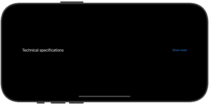
DisclosureGroup("Technical specifications") {
    VStack(alignment: .leading) {
        Text("Weight: 250g")
        Text("Dimensions: 10 x 5 x 2 cm")
        Text("Material: Aluminum")
    }
}
.disclosureGroupStyle(CustomDisclosureStyle())
// Continue_Learning
How to force navigation bar to show background in SwiftUI?
Learn how to force the navigation bar to show a background color in SwiftUI.
Using DisclosureGroup to hide and show content
How to use the SwiftUI DisclosureGroup view to create collapsable content.
SwiftUI Animations: From Basics to KeyframeAnimator
A practical guide to SwiftUI animations covering implicit and explicit animations, spring physics, PhaseAnimator for multi-step sequences, and KeyframeAnimator for timeline-based control.
// Stay Updated
Get notified when I publish new tutorials on Swift, SwiftUI, and iOS development. No spam, unsubscribe anytime.