- Published on
- 1 min read
> Using DisclosureGroup to hide and show content
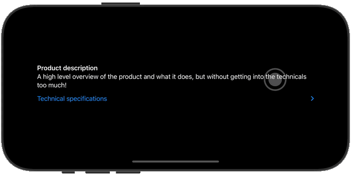
The DisclosureGroup view provides a convenient way to show/hide collapsable content in your app. Simply provide a title and a view that you want to hide to its content closure.
DisclosureGroup("Technical specifications") {
    VStack(alignment: .leading) {
        Text("Weight: 250g")
        Text("Dimensions: 10 x 5 x 2 cm")
        Text("Material: Aluminum")
    }
    .frame(
        maxWidth: .infinity,
        alignment: .leading
    )
}
If you need to keep track of when the disclosure group is expanded, you can utilize its optional isExpanded: Binding<Bool> binding.
struct ContentView: View {
    @State private var isExpanded = false

    var body: some View {
        DisclosureGroup("Technical specifications", isExpanded: $isExpanded) {
            // ...
        }
    }
}
// Continue_Learning
Creating custom styles for DisclosureGroup views
Learn how to use DisclosureGroupStyle to create custom DisclosureGroup views in SwiftUI.
SwiftUI Animations: From Basics to KeyframeAnimator
A practical guide to SwiftUI animations covering implicit and explicit animations, spring physics, PhaseAnimator for multi-step sequences, and KeyframeAnimator for timeline-based control.
How to Change the Background Color of a View in SwiftUI
Learn different ways to set background colors on SwiftUI views, from simple color fills to gradients and materials.
// Stay Updated
Get notified when I publish new tutorials on Swift, SwiftUI, and iOS development. No spam, unsubscribe anytime.